Charts
Using a slider to control values in a cell in Excel
Fri, 04/01/2013 - 12:26pm — jethroThis is a cool function that can assist you to make easy to use adjustable tables and charts.
Using the example of a mortgage, I used the mortgage template spreadsheet in Excel (under New Worksheet) to create a mortgage example. I then added a graph of the closing balance.
So now we have a nice looking chart that shows the closing balance of our mortgage over time.
Lets say we want to add the ability to easily change the additional payments and see graphically what that will do to our loan timeline. 
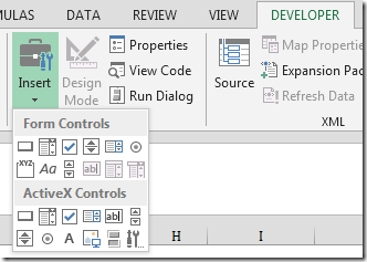
From the Forms toolbar select the spin button. Then click and drag your mouse where you want it on your sheet . You can resize it later if necessary.

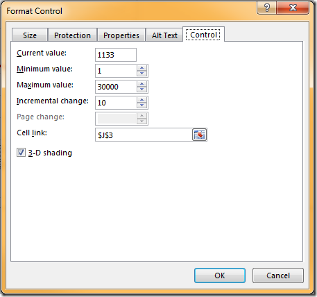
Now right click the control and select format control. Set it up as follows. 
Now you can scroll up and down and as you do the monthly loan payments changes by $10 a time, and the loan balance adjusts accordingly. Obviously you can make these settings what ever you desire for any application where you need to rapidly change 1 (or more) variable and see the results.
How to Use Excel to buy a Second Hand Car
Mon, 13/08/2012 - 3:34pm — jethroOne of our readers Daniel sent in an email a while back (actually 6 months ago sorry Daniel) about a detailed post he had written about how to Use Excel to find the Best Used Car Deals.
I wont repeat the whole article, but get you to go over to his site, read it and try it out and comment on how you found it to work for you. I will post a couple of snippets here for you as teasers.
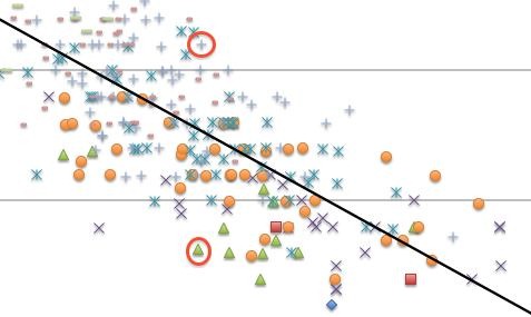
A used car can have any combination year and mileage. Both of these factors contribute to depreciation and make it very difficult to price-compare cars. Should you buy a 2011 model with 10,000 miles, a 2005 with 50,000 or a 2007 with 15,000 on the odometer? This guide shows you how to use Excel to find the “sweet spot” in the used car market for any given model, where depreciation and mileage come together to give you the best deal.
You’ll learn how to quickly scrape data from hundreds of used car listings on the Web, plot it in Excel and discover which model years are the best deal for a given mileage count. Instead of comparing between a handful of models, you’ll be able to see the whole market on your computer screen. This strategy also reveals which cars are the most overpriced and exposes information about how dealers price cars. This project will take an hour or two to complete, but save you thousands of dollars on a used car purchase.
Read the rest of his very detailed article with links, screenshots, a sample spreadsheet to download and try it yourself. Thanks Daniel.
Excel 2010 - some of the major advantages over 2003 or 2007
Tue, 01/06/2010 - 4:33pm — jethroThe Ribbon and Backstage
 Ok not everybody's favourite feature first time they switch from Office 2003. It does take some getting used to – and I still use keyboard short cuts for things. However the contextually sensitive ribbon has some major advantages over the old system. I honestly prefer the ribbon now especially in Microsoft Excel and Microsoft Word. In Office 2010 the ribbon can also be personalised.
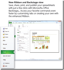
The backstage view (access from the File menu now places in one easy place all file management tasks such as save, share and print. All the similar commands are grouped together. No more going to 3-4 different places to set print settings for an excel file.
Here's the best way to think about the Ribbon and Backstage.
- The Ribbon is for everything you want to do in a document – insert stuff, format stuff, change stuff.
- The Backstage area is for everything you want to do with a document – print it, save it , share it etc.
Sparklines and Pivot Tables
If you thought pivot tables were cool ways to play with (analyse) data before than wait until you play with the sexy new pivot tables in Excel 2010.
And sparklines (inline in cell micro charts) are an excellent way of demonstrating trends in a small space. I can’t wait to start incorporating some of these features for some of our clients when they upgrade.
Check this pivot table taken from timesheet data. I added the pivot chart and sparklines in about 3 minutes flat.
Excel News - 2010, coding and other news
Thu, 18/03/2010 - 4:04pm — jethroIts been a while since i wrote an Excel only post – apologies for that. This one is all about Excel. Seeing as we are now less than 2 months away from Excel 2010 there’s a heavy focus on that. I am now using the beta on my production development machines though still using Excel 2003 in our virtual machine development environments. Some of our clients change slower than a glacier but we need to be able to support them.
Scatter charts with PowerPivot. Converting Pivot tables to cube formulas in order to access chart types not supported by Pivot tables. Sam has linked to Robs original post.
I have often used spin controls on spreadsheets to allow users to quickly and easily change inputs that affect charts or spreadsheet results. Cell Matrix has a good set of instructions on How to add an ActiveX SpinButton control to a spreadsheet in Excel 2007.


Recent comments
10 years 37 weeks ago
10 years 37 weeks ago
10 years 39 weeks ago
10 years 39 weeks ago
10 years 39 weeks ago
10 years 39 weeks ago
10 years 39 weeks ago
10 years 39 weeks ago
10 years 39 weeks ago
10 years 39 weeks ago